All posts by Ed Garcia

2008 logo design trends

Here is a great article by logoorange.com on the design trends expected in logo design for 2008. Most of these are right on the spot. But, if I didn’t disagree on some things you probably wouldn’t be reading this and there would be just a link to their article. Lets get to it and have a look at their categories:

Logos 2008 Qwell Logos 2008 SCreative Logos 2008 Bleutuna

Organic 3D – These logos are a mixture between the 3D design and standard logo design. They might include standard typography mixed with a 3D item that is there to call your attention. These logos have a huge flaw though; since some have transparency in them printing is a bit tricky. They must be on a specific-colored background most of the time, since the transparency of the item will show the color of the background damaging the image of the logo. That is if they are done to display the background color through, which should not be recommended at all.

Logos 2008 Asia Logos 2008 Computer Center REllingen Logos 2008 Plastic Whale

Waves are the new swooshes – The “flow feeling” is usually desired by many business owners and yet, in my opinion, we the designers can rarely achieve such a feel. Why? Well, flow is usually expected in movement and a 2D logo has no movement – besides perceived movement. We are changing “flow” elements for other “flow” elements here in the search of flow that can rarely be achieved in 2D imagery.

Continue reading

Steps for creating a logo that works

Jacob Cass, a designer from Australia, has some useful steps for designing a logo. I completely agree with him, the steps are the same ones I use.

Here is a short version, but for the full article and examples visit Just Creative Design.

Steps for creating a logo that works:

  1. Learn what a logo is and what it represents – logos exist in order to represent a non visual contraption. For example a company is not visible (their offices are), nor is the name of a product. You have the product being represented by itself because it is an object, but its name – it needs to be represented by a logo.
  2. Learn the rules and principles of logo design – the logo must show what it represents clearly, it must work weather it is in color or black and white, it must be easy to remember & the logo must be recognizable at 1 inch in size.
  3. Learn off others past mistakes – in other words, just look around you. You will see great logos to follow and “ugly” logos that you should learn from in order not to do the same mistakes. Continue reading

Photoshop body enhancement tutorials

Photoshop iconAll designers get so-so photos all the time. Is is time to reshoot the photo? Do you have time? Most of the time the answer is no; and there is where the photo manipulation capabilities of Photoshop come into play.

Looking to clear up skin? Enhance eyes? No makeup on the model? Wrong hair color for the page you are using? Need a blond? Need a brunette? Need them skinnier? Remove some love handles? No problem, Photoshop is here.

Follow the link for 33 Photoshop tutorials that can help!

Engadget.com – Optimus Maximus keyboard

Optimus Maximus Keyboard
If you have been looking for the holy grail of keyboards it seems you will have to wait. For now, the highly anticipated Optimus Maximus – is already shipping from artlebedev.com and Engadget.com got one for testing. Now, almost every gamer and designer out there is salivating to know if it is worth the almost 3 year wait and worth the “are you kidding me?” $462 price tag. Short story – it doesn’t seem worthy of either. Yes, that price is JUST for a keyboard.

Well according to the first impressions of Engadget.com the Optimus Maximus is a very nice keyboard that fails at the basic premise of being a keyboard. Confused? Well they say the keys are very hard to press and do not flow like a keyboard should, causing unnecessary strain and fatigue for your hands.

For those that never heard of this keyboard, the idea is having a keyboard that can display an image in real time on each separate key. This can offer incredible customization to your work flow. Imagine keys that change depending on which programs you are actually using, keys that display a status like something as simple as “new emails” or any other notification you usually need. But, that is not all we users wanted; we also wanted a usable keyboard.

It seemed to me like an epic fail ever since they announced the price. But there was always hope. If you consider that technology which succeeds is lowered in price as time goes by; this is the best idea for a keyboard in a long time. If it doesn’t sell well, there will always be someone else that takes the idea and perfects it, the Optimus Maximus “new and improved” 2.0 or the desinger’s latest Optimus Tactus.

only in Japan: the best tech you can’t buy

PC World has a very interesting article about technologies that we can’t buy, well at least not in the USA.

Imagine a cell phone that offers true TV capabilities, works as your bus/subway/train pass, it links sales to a credit card (wave your cell phone at the register), tells your car where to go, which route has less traffic and which gas station is cheaper, and can even warn you of an impeding disaster like an earthquake. And this is a phone we are talking about here, not a computer you have to carry on your back.

Sounds like science fiction but it is reality at the other side of the world, in Japan. Read the article for more info.

10 principles of effective web design

Talking Pointer Usability
Here is an article that exposes usability in 10 easy to understand points through web design. Smashing Magazine also has older usability articles like 10 usability nightmares and 30 usability issues. They are all a must read.

One very important item, before I comment on their 10 points, is that users DON’T READ a website, users actually SCAN a website for information, then read. Something I scream to the wind as being true, and that actually explains a few of the points below.

Here are Smashing Magazine’s 10 principles of effective web design with my comments; do read their article for their original view and examples.

  1. Don’t make users think – Simple, lay your website components out in an organized fashion and let users select what they want.

  2. Don’t squander users’ patience – Users have all control, bother them with too much work, too many forms to fill (specially if you give them no incentive before they start) and they will leave.

  3. Manage to focus user’s attention – Call attention to those parts of the website that are important, but don’t do over do it so you don’t undermine the other parts of the website. “Not all users are on the site for this month’s special.

  4. Strive for feature exposure – Guide your users on the site. Simple visual or text cues can make a huge difference. Continue reading

colors and flavors, it’s all in your mind

Colourlovers.com has an article about the effect of the color of your food, and how colors actually can change the flavor your mind actually receives. The authors of the study Taste Perception: More than Meets the Tongue, Journal of Consumer Research described the phenomena as “Color dominated taste.”

Green Ketchup 
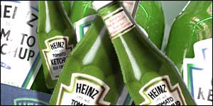
You might remember the product to the left. Most people said they could taste a difference between the red and the green ketchup. But HEINZ said that the content of both the regular colored ketchup and the green ketchup were the same, with the exception of the flavor-less colorant.

That is the kind of response that is mentioned in the original article.

we keep multiplying

WebsitesOnlineJan08A report by NetCraft.com for January 2008 reports that 155,583,825 websites responded to their tests. Although, compared to 5.4 million new websites in December 07 the increase of 354 thousand sites for January might not seem like much.

But when you think at the mass of the number, and let me spell this number, “one hundred fifty five million, five hundred eighty three thousand, eight hundred & twenty five” websites being currently online you just have to think how fast this business is multiplying, and has kept multiplying, for the last 13 years of it’s existence. It is great to be part of it all.