Here is a great article by logoorange.com on the design trends expected in logo design for 2008. Most of these are right on the spot. But, if I didn’t disagree on some things you probably wouldn’t be reading this and there would be just a link to their article. Lets get to it and have a look at their categories:


Organic 3D – These logos are a mixture between the 3D design and standard logo design. They might include standard typography mixed with a 3D item that is there to call your attention. These logos have a huge flaw though; since some have transparency in them printing is a bit tricky. They must be on a specific-colored background most of the time, since the transparency of the item will show the color of the background damaging the image of the logo. That is if they are done to display the background color through, which should not be recommended at all.


Waves are the new swooshes – The “flow feeling” is usually desired by many business owners and yet, in my opinion, we the designers can rarely achieve such a feel. Why? Well, flow is usually expected in movement and a 2D logo has no movement – besides perceived movement. We are changing “flow” elements for other “flow” elements here in the search of flow that can rarely be achieved in 2D imagery.
Continue reading →

A nice article by Wired.com show the design process for Google’s now famous logo. There are many samples the company went through before selecting the logo that we all know and love.
Follow the link to read more about the logo’s history and see more samples.
Here is an article that exposes usability in 10 easy to understand points through web design. Smashing Magazine also has older usability articles like 10 usability nightmares and 30 usability issues. They are all a must read.
One very important item, before I comment on their 10 points, is that users DON’T READ a website, users actually SCAN a website for information, then read. Something I scream to the wind as being true, and that actually explains a few of the points below.
Here are Smashing Magazine’s 10 principles of effective web design with my comments; do read their article for their original view and examples.
-
Don’t make users think – Simple, lay your website components out in an organized fashion and let users select what they want.
-
Don’t squander users’ patience – Users have all control, bother them with too much work, too many forms to fill (specially if you give them no incentive before they start) and they will leave.
-
Manage to focus user’s attention – Call attention to those parts of the website that are important, but don’t do over do it so you don’t undermine the other parts of the website. “Not all users are on the site for this month’s special.“
-
Strive for feature exposure – Guide your users on the site. Simple visual or text cues can make a huge difference. Continue reading →
Colourlovers.com has an article about the effect of the color of your food, and how colors actually can change the flavor your mind actually receives. The authors of the study Taste Perception: More than Meets the Tongue, Journal of Consumer Research described the phenomena as “Color dominated taste.”
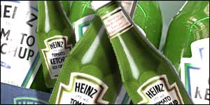 You might remember the product to the left. Most people said they could taste a difference between the red and the green ketchup. But HEINZ said that the content of both the regular colored ketchup and the green ketchup were the same, with the exception of the flavor-less colorant.
That is the kind of response that is mentioned in the original article.
design & technology, united