Here is a great article by logoorange.com on the design trends expected in logo design for 2008. Most of these are right on the spot. But, if I didn’t disagree on some things you probably wouldn’t be reading this and there would be just a link to their article. Lets get to it and have a look at their categories:


Organic 3D – These logos are a mixture between the 3D design and standard logo design. They might include standard typography mixed with a 3D item that is there to call your attention. These logos have a huge flaw though; since some have transparency in them printing is a bit tricky. They must be on a specific-colored background most of the time, since the transparency of the item will show the color of the background damaging the image of the logo. That is if they are done to display the background color through, which should not be recommended at all.


Waves are the new swooshes – The “flow feeling” is usually desired by many business owners and yet, in my opinion, we the designers can rarely achieve such a feel. Why? Well, flow is usually expected in movement and a 2D logo has no movement – besides perceived movement. We are changing “flow” elements for other “flow” elements here in the search of flow that can rarely be achieved in 2D imagery.
Continue reading →
Jacob Cass, a designer from Australia, has some useful steps for designing a logo. I completely agree with him, the steps are the same ones I use.
Here is a short version, but for the full article and examples visit Just Creative Design.
Steps for creating a logo that works:
- Learn what a logo is and what it represents – logos exist in order to represent a non visual contraption. For example a company is not visible (their offices are), nor is the name of a product. You have the product being represented by itself because it is an object, but its name – it needs to be represented by a logo.
- Learn the rules and principles of logo design – the logo must show what it represents clearly, it must work weather it is in color or black and white, it must be easy to remember & the logo must be recognizable at 1 inch in size.
- Learn off others past mistakes – in other words, just look around you. You will see great logos to follow and “ugly” logos that you should learn from in order not to do the same mistakes. Continue reading →
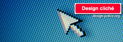
The title should come as no surprise; but thanks to that fact we can drive developers and programmers crazy sometimes.
We are picky on what goes where (layout), picky on which color to use (color combination), picky on how images should display (image manipulation), and if you are head of the project – specially picky on how the system works (design usability) and finally picky on the details that make the project look complete. These are pieces of the puzzle that some programmers and developers only pay light attention to. Just look at design-police.org for guidelines; yeah we have that many.
Although a system can -work- correctly, it might not display correctly or it might not give the impression a finished system should give. On the other side of the coin, programmers do pay attention to other parts of the system that we might not pay as much attention to. A programmer, somewhere, is mentioning this concept in a programming blog.
Continue reading →
design & technology, united