Below you will find examples of my work divided in categories, based on your needs. If you need anything design oriented that is not shown here, feel free to contact me.
website design | customer relationship management (C.R.M.)
logo design & corporate image | print media design
package design | multimedia | photography | digital photo retouch
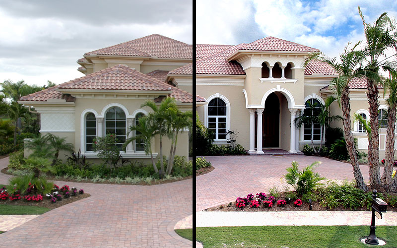
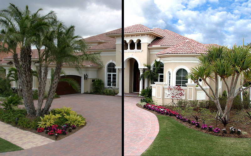
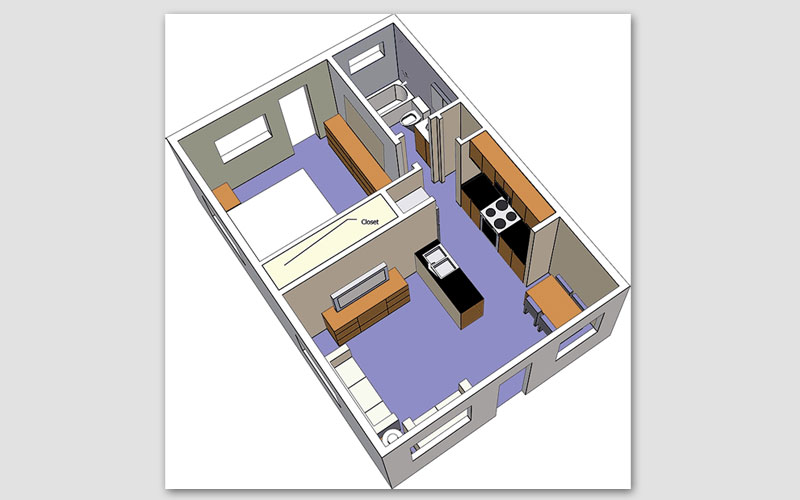
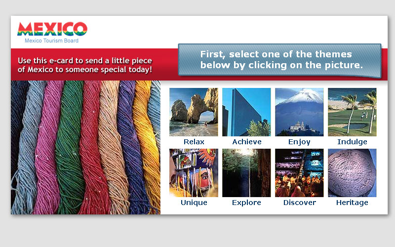
website design
Showroom websites, e-commerce websites, blogs & specialty-related websites like hotels and real estate. Got an incredibly unique idea? Let’s build the perfect custom solution. On a budget? Not every website needs to be custom built; there are plenty of solutions that exist already which can save you money on development. Your needs will determine which website is right for you, lets find the best solution.

web-based Customer Relationship Management
Some websites sell products, some websites display them and some websites are a central hub to your business. The ability for your sales team to take care of customers, place orders and offer full support – all from anywhere with internet access. You can get any custom report you might need; sales by sales person? sales by customer? sales by division? what are your needs? A CRM can simplify your business. It frees you, and your sales team, from the office and can keep you updated on everything that goes on with your business anywhere you have internet connection.
What are your needs?

logo design & corporate image
Your products and your corporate image are the only means your customers can separate you from your competitors. Research will find the ideas that will best represent your company. Logo design will take those ideas and render them visually into a logo that represents your company. That is as far as company logo design goes; but logo design goes much farther. Logo design can include logos for actual products, services and special events. Research will always bring forward the best solution. Let’s begin!

print media design
newspaper & magazine ads, postcards, billboards and any other printed medium that help you reach your customers

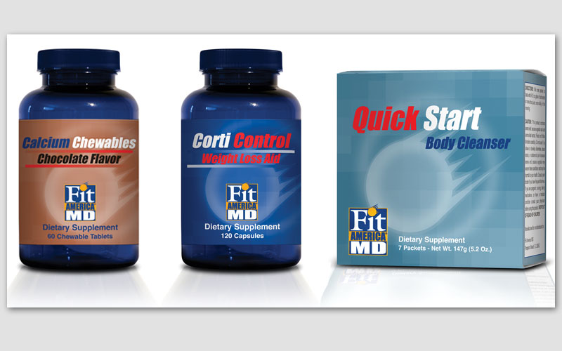
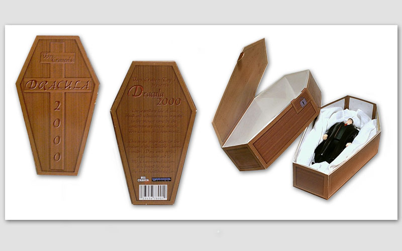
package design
stand out from the crowd – at point of sale your product’s #1 influence is brand recognition
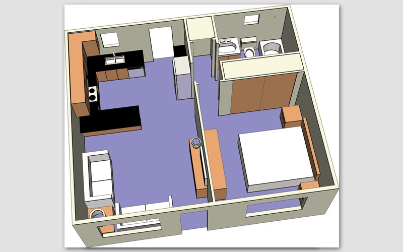
multimedia
a mixture of design, art and technology
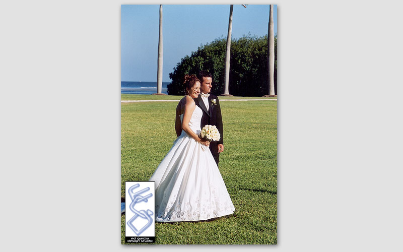
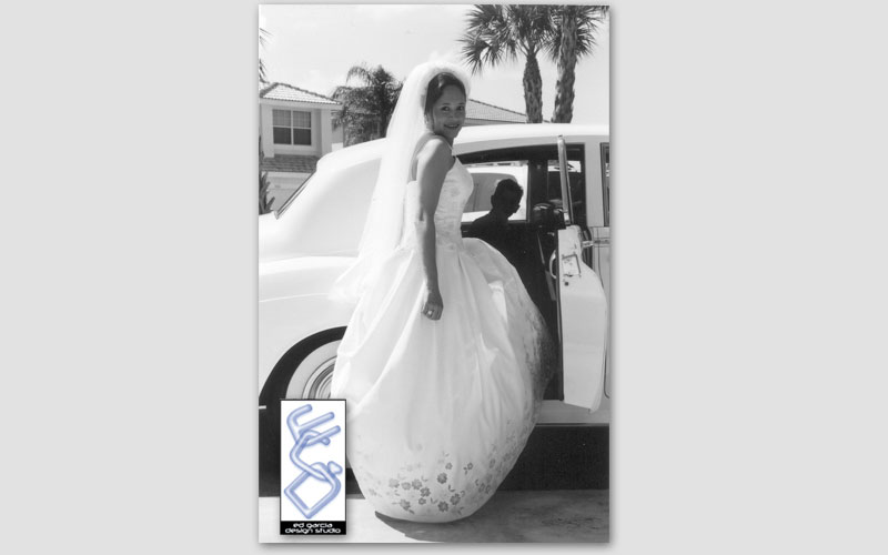
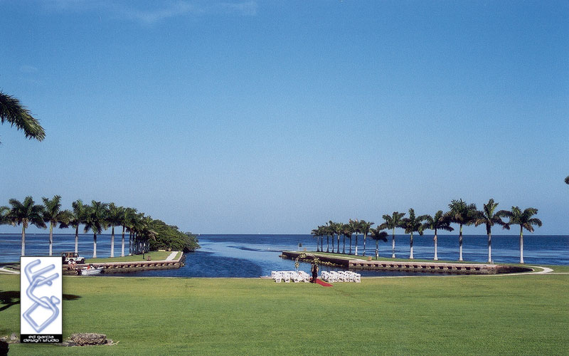
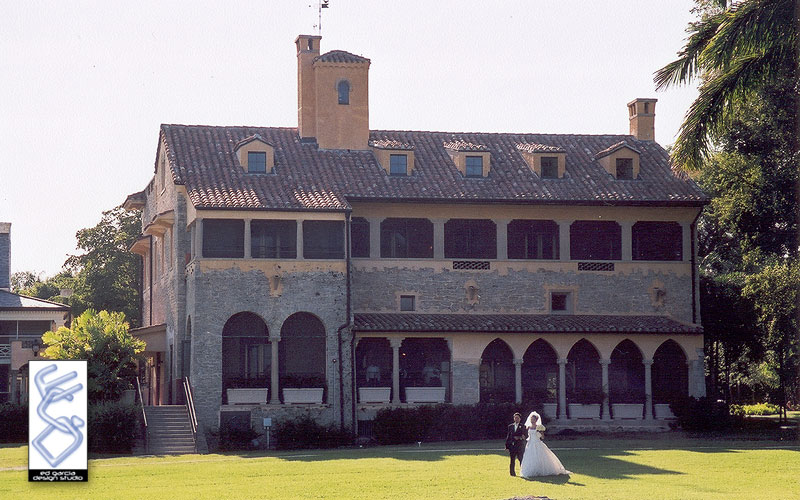
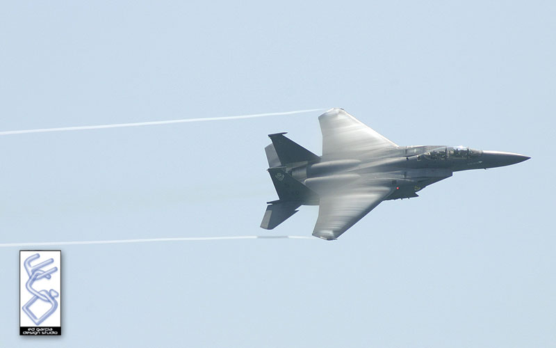
photography
a memory captured as an image, a product’s best look, a celebration that needs to be remembered
 |
 |
 |
 |
 |
 |
 |
 |
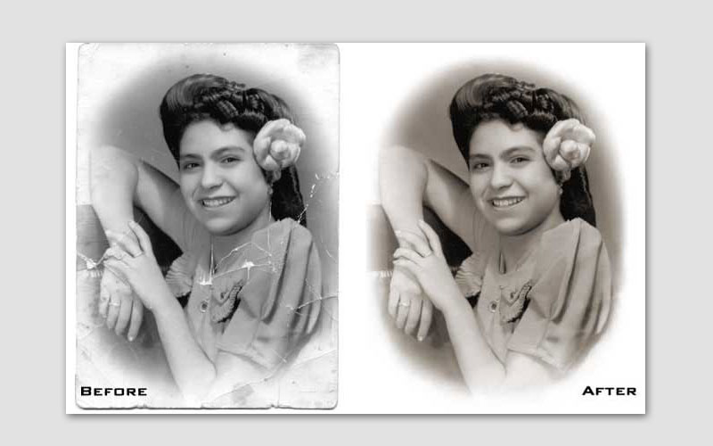
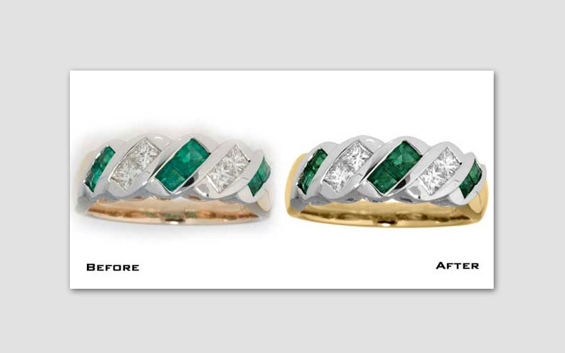
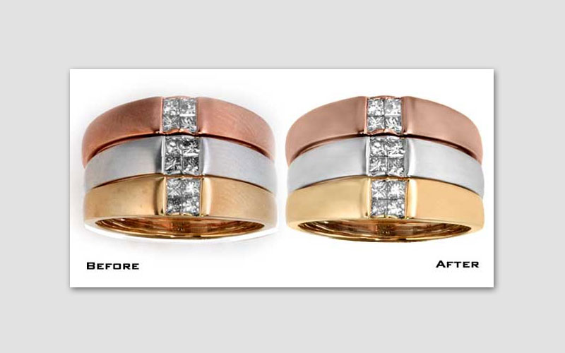
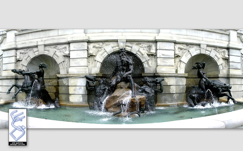
digital photo retouch
even a great photo can be enhanced, a not-so-great photo can be fixed to fit your needs and miracles can happen on aged photographs