
A nice article by Wired.com show the design process for Google’s now famous logo. There are many samples the company went through before selecting the logo that we all know and love.
Follow the link to read more about the logo’s history and see more samples.
Here is an article that exposes usability in 10 easy to understand points through web design. Smashing Magazine also has older usability articles like 10 usability nightmares and 30 usability issues. They are all a must read.
One very important item, before I comment on their 10 points, is that users DON’T READ a website, users actually SCAN a website for information, then read. Something I scream to the wind as being true, and that actually explains a few of the points below.
Here are Smashing Magazine’s 10 principles of effective web design with my comments; do read their article for their original view and examples.
-
Don’t make users think – Simple, lay your website components out in an organized fashion and let users select what they want.
-
Don’t squander users’ patience – Users have all control, bother them with too much work, too many forms to fill (specially if you give them no incentive before they start) and they will leave.
-
Manage to focus user’s attention – Call attention to those parts of the website that are important, but don’t do over do it so you don’t undermine the other parts of the website. “Not all users are on the site for this month’s special.“
-
Strive for feature exposure – Guide your users on the site. Simple visual or text cues can make a huge difference. Continue reading →
Colourlovers.com has an article about the effect of the color of your food, and how colors actually can change the flavor your mind actually receives. The authors of the study Taste Perception: More than Meets the Tongue, Journal of Consumer Research described the phenomena as “Color dominated taste.”
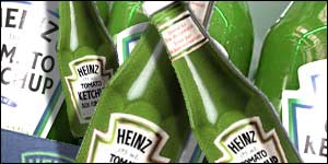 You might remember the product to the left. Most people said they could taste a difference between the red and the green ketchup. But HEINZ said that the content of both the regular colored ketchup and the green ketchup were the same, with the exception of the flavor-less colorant.
That is the kind of response that is mentioned in the original article.
If you are into usability and interface design these are a must; a great book collection by Smashing Magazine. If you are a web designer or developer some will actually help you not make common mistakes, others will take your techniques farther, but understanding them will surely improve the usability of your projects.
Here is their list:
-
About Face 3. The Essentials of Interaction Design by Alan Cooper, Robert Reimann and David Cronin
-
Prioritizing Web Usability by Jakob Nielsen, Hoa Loranger
-
Designing the Obvious. A Common Sense Approach to Web Application Design by Robert Hoekman, Jr.
-
Don’t Make Me Think. A Common Sense Approach to Web Usability by Steve Krug
-
The Design of Sites. Patterns for Creating Winning Web Sites by Douglas Van Duyne, James Landay, Jason Hong.
-
The Design of Everyday Things by Donald A. Norman
-
Designing Interfaces: Patterns for Effective Interaction Design by Jenifer Tidwell
-
Designing for Interaction: Creating Smart Applications and Clever Devices by Dan Saffer
-
Designing Interactions by Bill Moggridge
-
Envisioning Information by Edward R. Tufte
This is only a partial list; for the complete list (they include editor choices) and for more information on each book read the Smashing Magazine article.
design-police.org offers graphic design guidelines to stick it to bad design in a clever “sticky notes” way to mark a document. Their kit is called the “Visual Enforcement Kit”.
We designers find these funny. Why? Because we sadly see these mistakes over and over on every piece of media. It is part of the job, and what exactly makes these funny, sad and oh so true. :)
design & technology, united