subscribe

Archive for the ‘design’ Category

Excellent collection of Photoshop tutorials

Monday, January 28th, 2008

Photoshop icon

Smashing magazine has an great collection of Photoshop tutorials. Anything from rendering products, lightning effects, retouching photos and improving their look, reflections, creating product boxes… you name it and it is probably there.

The list of tutorials is over 30 pages long, and that is not counting how long each tutorial is. So if you have a lot of free time to master your Photoshop skills this is a very good place to start; also a great page to bookmark since you won’t be done with those tutorials in a while and you might need them later.

10 usability and interaction design books

Sunday, January 27th, 2008

If you are into usability and interface design these are a must; a great book collection by Smashing Magazine. If you are a web designer or developer some will actually help you not make common mistakes, others will take your techniques farther, but understanding them will surely improve the usability of your projects.

Here is their list:

  1. About Face 3. The Essentials of Interaction Design by Alan Cooper, Robert Reimann and David Cronin

  2. Prioritizing Web Usability by Jakob Nielsen, Hoa Loranger

  3. Designing the Obvious. A Common Sense Approach to Web Application Design by Robert Hoekman, Jr.

  4. Don’t Make Me Think. A Common Sense Approach to Web Usability by Steve Krug

  5. The Design of Sites. Patterns for Creating Winning Web Sites by Douglas Van Duyne, James Landay, Jason Hong.

  6. The Design of Everyday Things by Donald A. Norman

  7. Designing Interfaces: Patterns for Effective Interaction Design by Jenifer Tidwell

  8. Designing for Interaction: Creating Smart Applications and Clever Devices by Dan Saffer

  9. Designing Interactions by Bill Moggridge

  10. Envisioning Information by Edward R. Tufte

This is only a partial list; for the complete list (they include editor choices) and for more information on each book read the Smashing Magazine article.

iRing design by Victor Soto

Saturday, January 26th, 2008

iRing design by Victor Soto

Apple lovers, keep in mind this is just a concept and not coming to stores any time soon so don’t go asking for it at the Apple store just yet.

The iRing, a concept design by Victor Soto, is meant to connect to the iPhone or iTouch via bluetooth. (although the iTouch doesn’t have bluetooth right now) It would control functions like volume, move back and forward through you songs or media, and mute. All this through touch sensitive controls on the surface of the ring; it also employees a lock mechanism so you don’t go changing the volume because you moved your hand.

A bit ahead of it’s time in terms of actual implementation, but I believe it is a nice idea on what the future can hold for device control. It was made with the Apple products in mind, but imagine music systems and TVs that can be controlled this way.

Imagine never running around the house trying to find the TV remote, it is always in your hand. I surely want to imagine that.

Welcome GLCC visitors

Thursday, January 24th, 2008

Stars of the Rainbow LogoJust wanted to give a shout to those visitors from the GLCC ads. The GLCC is about to have their annual Stars of the Rainbow gala and celebration; their way to congratulate those that helped the GLBT community during the past year.

Save the date Sunday, February 17th 2008 and RSVP for this year’s gala. Contact Nicole for info.


Funny, sad and true - Visual Enforcement Kit

Monday, January 21st, 2008

design-police.org offers graphic design guidelines to stick it to bad design in a clever “sticky notes” way to mark a document. Their kit is called the “Visual Enforcement Kit”.

We designers find these funny. Why? Because we sadly see these mistakes over and over on every piece of media. It is part of the job, and what exactly makes these funny, sad and oh so true. :)

Helvetica - a typography movie

Monday, January 21st, 2008

google video has a movie that discusses typography. An interesting watch for those in the design business.

From the description: “Helvetica is a feature-length independent film about typography, graphic design and global visual culture.”

Website redesign, finally!

Sunday, January 20th, 2008

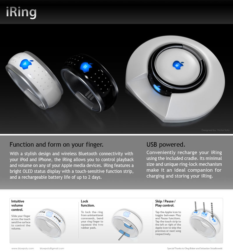
After 4 years I have updated my website at last. New graphics, new content system & the same domain name. A mixture of modern design, metallic/glass effects and soon flash animations that are not menu related. I think we all can agree that the web has slowly outgrown the flash animation craze, especially the flash intros - oh the horror! :)

To everyone that kept asking me “Why do you have nice designs on your portfolio and you don’t redesign your website?” Well, time always had a hand on the reason. I have kept busy the last three years; I worked for those of you that asked me that same question. Some of you are the same persons that have been there with me in my 12 year career through design and technology, including my last 3 years working as a consultant.

This is a great feeling of accomplishment, thanks.

Deciding on what web publishing software to use was another reason this took so long. I looked at a few solutions, including creating it from scratch like I do most of the time. I finally decided to use WordPress as it has the biggest support community out there. Great software, pretty easy to work with and templates seem highly customizable. As you can see you can make your site look anyway you want and still carry over all the built-in functionality of the original. It’s administration panel is very easy to use, which for you as an end user, is one of the best reasons to use it on your projects. Thus far, WordPress comes highly recommended and big thanks to the WordPress community for all the plug ins, gadgets and support that permit releasing a website like this so fast.

I hope you enjoy the website and leave comments using the link below.