Here is a great article by logoorange.com on the design trends expected in logo design for 2008. Most of these are right on the spot. But, if I didn’t disagree on some things you probably wouldn’t be reading this and there would be just a link to their article. Lets get to it and have a look at their categories:
![]()
Organic 3D – These logos are a mixture between the 3D design and standard logo design. They might include standard typography mixed with a 3D item that is there to call your attention. These logos have a huge flaw though; since some have transparency in them printing is a bit tricky. They must be on a specific-colored background most of the time, since the transparency of the item will show the color of the background damaging the image of the logo. That is if they are done to display the background color through, which should not be recommended at all.
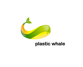
Waves are the new swooshes – The “flow feeling” is usually desired by many business owners and yet, in my opinion, we the designers can rarely achieve such a feel. Why? Well, flow is usually expected in movement and a 2D logo has no movement – besides perceived movement. We are changing “flow” elements for other “flow” elements here in the search of flow that can rarely be achieved in 2D imagery.
I personally try to stay away from trends like this one unless specifically requested; in my opinion logos created in such a fashion look dated in just a few years. The swooshes of yesterday are the waves of today, the same way we will use another element to represent flow tomorrow – just then the waves will look dated. It is to be noted that not all logos that have “waves” will look dated. If done in a innovative way by themselves (like the Plastic Whale logo above) the logo will withstand time because the wave is not there just because; the wave was used as part of the logo’s icon.
![]()
Web 2.0 Logos – First I will admit I completely hate the name; there is no such thing as a Web 2.0 logo in my opinion. In truth there is no such thing as a web 2.0 – there I said it. The whole web 2.0 trend is marketing fluff for new web development techniques and programming languages. When that name is mentioned, all developers and designers are telling you is that newer web technologies are being used – like Ajax, Ruby and others.
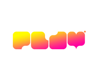
Web 2.0 programming is a bit more “visually flexible” than older technologies used in web development. Because of that fact new design techniques are being used to match the technology. These logos reach for a high-tech, yet friendly, look. Most of the time, they work as requested and are eye catching enough to be different from the rest of the logos out there. Sans the name, if you are looking for a “3D” feel that you can actually print without much trouble, Web 2.0 logo style is a growing trend that is actually creating great logos. But please don’t fall victim to the hype nor the hate.
![]()
![]()
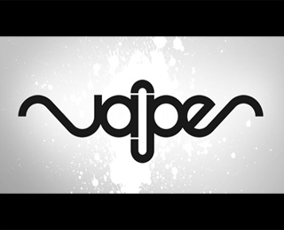
“Underground Typography” / minimalistic fonts – If you use a “Web 2.0 Logo” and you take away the icon from the logo, add the use of minimalistic fonts to look like a design on itself, make the mistake (IMHO) of using a background color and you get this type of logo. These might not be the most crystal clear logos when it comes to readability but that is how they actually work. These are the type of logos that make the audience do a double take – even if it is because they can’t read the logo. But when you have the audience do a double take they are now actively interacting with your logo- which more than what you can expect from most logos.
I believe this is a growing trend that works, but still needs some refinement if it is to be used on print media. The use of a background color is something that logo designers usually frown upon, me included. A fix some designers offer is creating multiple versions of the logo – one for the website and another for print. It works, but your brand recognition suffers whenever you have more than one version of your logo. Creating these logos with a mind towards flexibility for print should be the next step. Hey, use a background color but do give it a shape so that background is part of the design. This is a trend that will be interesting to watch as it matures in the future.
![]()
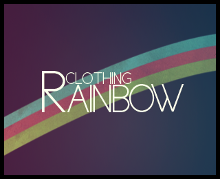
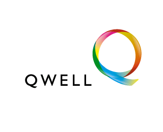
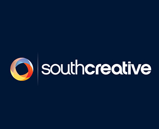
New Rainbow / Color Scale – I am not entirely sure this can be considered a “style” of logo. I would categorize this as a “logo element” but not as a logo style. All these bring to the table is the natural human fascination with color and how much your eye attention is caught with these. The trend now is the use of a dark background with a series of colors scales that call attention, let it be a rainbow or shades of complementary colors and you get this effect.
![]()
![]()
Sci-Fi Fonts – I am guilty as charged, just take a look at my own “EGD” logo to the left. Those that have worked with me in the past know that it was not until last year that I decided to let go and change my logo. As mentioned in the article these technically oriented fonts were frowned upon in the late 90’s early 00’s as a design fad but they have not gone away. I always liked them but it hasn’t been until recently that they have reached the main public. They are somewhat similar to the minimalistic font use – but this time the text is not overly designed so if done correctly readability is still #1. It should be important to note some of these “Sci-Fi” fonts can also be minimalistic fonts that look very similar to the ones mentioned earlier.
![]()
![]()
![]()
Leaves logos – The use of leaves in logos just keeps growing. It could be a direct influence of the ecology movement or an actual growing need for humans to connect with nature. The problem here is that unless they are designed for a eco-friendly company or , that actually wants that to be their image, they don’t make much sense. Why would you use a leaf for a logo created for a web – computer – programming – auto parts company? It doesn’t work at all, and unfortunately they are being overused because companies are trying to look eco-friendly just for the sake of it. On the other end, logos like the Ivi Arch Studios are above this because the leave is actually related to the company name.
![]()
The Ugly 80s – These are logos that can easily be considered “ugly”. And they actually are sort of ugly, and yet designed ugly for a reason. Although beauty is still in the eye of the beholder, the power to create an ugly logo in order to attract attention is in the hands of a designer. And here comes a reality check – these logos are NOT for everyone; actually they have a very small market. They are especially not for you if you are looking to start a company and you have no brand recognition. You don’t want an ugly logo to represent your company in its first few years and not every market is open to understand why you chose this logo. Even if you have an established company, a logo like this is a very bold move that might or might not work for you. These probably work better for events and other logo needs that are seasonal. I can’t openly recommend them with a straight face.
![]()
![]()
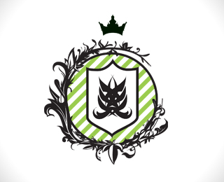
The New Crest -The classic crests reborn for this year? Seems like it. These logos are more exciting than the standard old crest style and they seem to be able to merge into the other categories as well; notice how simple a crest logo can be in the Honest Forum logo compared to the much more intricate Griffon Logo.
Remember for more info and more examples read the original article by logoorange.com Most logo examples on this page come from FaveUP! – great collection for inspiration!